
"Heuristic" means enabling someone to discover or learn something for themselves. Users won't have the benefit of the owner of the site to be by their side as they navigate, so conducting a heurustic evaluation is a good way to get a new set of eyes on your site. When kicking off a web site redesign prioject, we conducted a heuristic evalutaion on the current Logical Foundation web site, documenting usability, user experience issues and highlighted suggestions based on best practices that we would be implementing, and why they were important.
Design considerations
Design
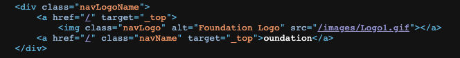
The very first thing users and potential donors will see is the logo, and the it’s unclear what the mark is. A "T" and the "F" are visible, but it's unclear what it represents. It resembles a picture of hardware, like a bolt.
Another important issue with this logo treatment is that it obscures two of the three words in the organization name: “The” and “Logical,” leaving only “oundation” which feels like a typo. Even worse, in the html, the very first text on every page is “oundation” which won’t help people find this page if they’re searching for your organization. Consider developing an updated logo and type lockup.
The type size is large and easy to read, but isn’t defined, so it just pulls in whatever san serif font the browser serves up. Consider using a modern typeface from Google such as Lato, which provides many weights, is easy to install on your pages, and will help standardize your brand vocabulary. On mobile devices, without an explicitly declared typeface, the buttons and forms use a different typeace family than the desktop site.
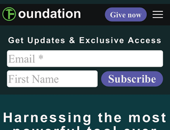
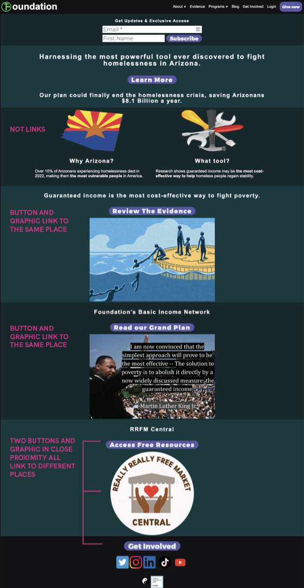
On the home page there are two large clip art graphics, an illustration, a photo and a really large logo for another organization. Consider standardizing the graphic treatments. FlatIcon and The Noun Project are good resources for icons.
Links
The gray type that acts as the hover color over body links is hard to see against that teal, but especially so if a user is color blind or struggles with areas of low contrast. Links are one way readers scan for important information on a web page, and as such they need to be obvious. They should not only have good contrast against the background of the page, but also the surrounding body copy. Consider adding a hover underline and keeping the text white to boost the perception of the link (of course if body type is changed onto a white background then a darker underline).
As a rule of thumb, think about mobile users first. On a mobile device, there is no ability to hover, so links have to be obvious without any additional interaction from the user.
All links should also have an title and ALT attribute, so if a user hovers over the link they get a tool tip that says the name of the target page. This is a nice to have for sighted users, but users who use a screen reader thy won’t have any idea what the link is or where it’s going without following the link, then having to navigate back every time.
External link icon
Consider adding an external link icon to links that go to sites other than your own. This is helpful for people who don’t want to leave your site, or would prefer to open the links in other tabs for later reading. The external links already open in a new window, so that’s good, but it would be nice to let users know it was going to happen.
CSS Switcher (Dark mode)
I eventually found the animated yin and yang symbol at the bottom that changes the color palette, and while that functionality is good it’s hidden behind an icon that isn’t clear, and the default setting being the dark teal should probably be changed to respect the user's browser/device preferences.
Home Page
Scannability
People are more likely to scan your pages and not read them. The Internet is merciless regarding text, so users need to get right to the content they want. This content is fairly scannable, but it’s unclear where one should start. The hierarchy isn’t immediately obvious when users land on the page, which helps provide users an information scent about how the site works and how they can interact with it.
The H1 (Harnessing the most powerful tool ever discovered to fight homelessness in Arizona.) not only should tell users what the page is about, but it helps search engines the same way. Without a clear headline it’s not obvious what the page is.
The full name of the organization isn’t present in the keywords, but is in the description. Search engines don’t really weight keywords any more, so a better-crafted version of the description is important.
Example from benefits.gov:
<”Benefits.gov is an online resource to help you find federal benefits you may be eligible for in the United States.”/>
Consider bringing the mission statement up from the About page to the home page and using it in the meta description tag on the home page:
At The Logical Foundation, our mission is to ensure a prosperous future for humanity by unleashing the massive anti-poverty potential of guaranteed income.
This immediately tells readers whose site they’re on and what the goal of the organization is.
Email sign up
Building up a name and email database is important, especially for nonprofits. However, having the sign up first thing on the page probably has the opposite effect. Users need to know what they’re getting when they sign up with an organization...it’s essentially a trade. If the benefit isn’t worth the risk of one getting spammed or worse, having their email address sold off, they won’t sign up.
Consider giving users some examples of what they’ll get with that Exclusive Access, which will likely entail it going on another page, or at least further down where additional context could be provided, or even in the footer so it appears on every page.
Secondary page links
Without a clear path on the page, users will scroll and look for the content they’re interested in. On the home page, in addition to the navigation, there are seven buttons and five large images - of which only three are links, but it’s unclear which are which and where they go. The bottom one for the Really Really Free Market looks like a sponsored banner ad, but it links to the About Us page. Consider streamlining the page and making the calls to action easier to see, such as text links in copy.
The Really Really Free Market icon should probably link to the resources page if that page remains, as that’s the page that holds the RRFM content. It should be made more obvious that the graphic is a clickable banner.
About Us
Scannability
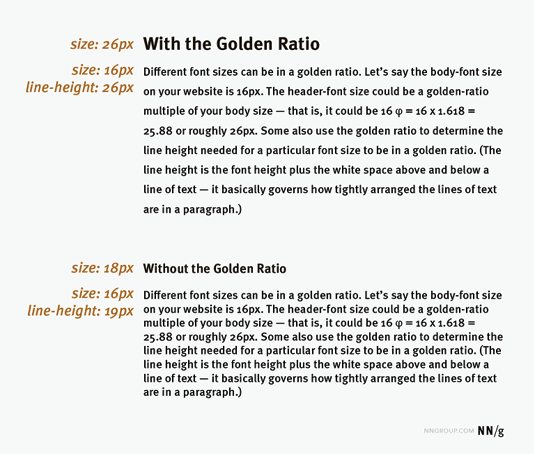
This page has a lot of text on it, and while that’s not a bad thing, the long line lengths make reading more difficult than it needs to be. Combined with dark text on a light background, consider shortening the lines using an 8/4 column structure and slightly more line spacing; adding in subtitles where appropriate would help as well.
The Medium web site is a good example of keeping line length to a readable length.
Referencing the Golden Ratio is a simple way to achieve a comfortable reading size. This will vary slightly on the typeface selected.
Frequently Asked Questions content
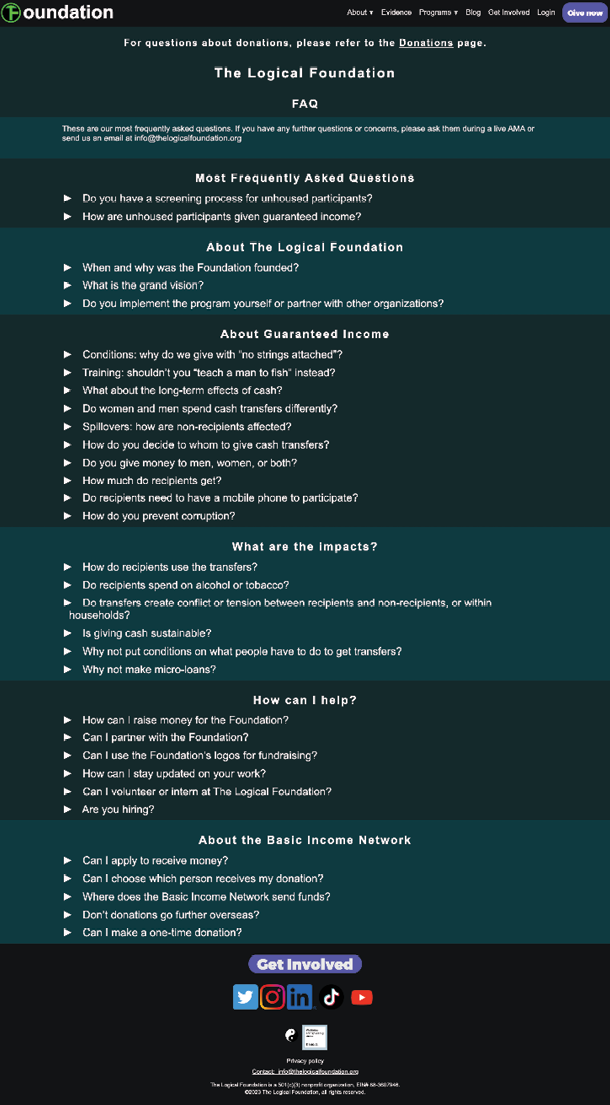
Most Frequently Asked Questions
Calling these two out on a page full of questions is an odd choice. FAQs are typically sorted by popularity, so logically the most frequently asked questions would be at the top of the list.
Sections
Sorting these questions into categories is a good idea with a list this long. Consider adding a mechanism in each section to expand all so folks who intent on reading the whole page can do it in one motion.
For search engine optimization, FAQ sections on individual pages do really well, as opposed to one large page. Moving forward, that change might be worth implementing.
Alignment
The carets on the FAQ links don’t align properly when the question is longer than one line or on a mobile device, causing a strange ragged-left effect.
Free Resources
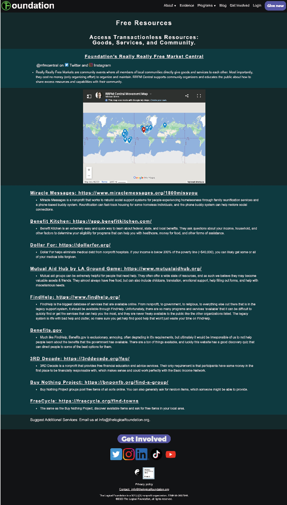
Audience
It’s a little unclear who the audience for this page is. If the main goal of the site is to validate the foundation and get buy in for the program, this page feels like it’s made for people who will benefit from the program. Could these resources be worked into other content elsewhere on the site?
This link at the top looks like a title...I didn’t even realize it was clickable until coming back to the page and accidentally mousing over it. Elements that work the same should look the same; consider reformatting this section so it’s obvious what’s a link and what isn’t.
World map
It's unclear what value the interactive map adds to the page. It’s interesting, but after clicking on a couple of European cities just to see what was there, I ignored it. It occupies a lot of visual space for something with no clear user benefit.
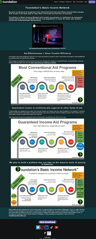
Basic Income Network page
Infographics
These charts are nice and visual, but the differences between the three charts are difficult to see since at best only two of the charts are partially visible on the screen at one time. Consider a way to show this information all on one graphic to make comparison between the three programs easier for readers.
Type in the charts are not only different than the body copy on the page, but the type blocks on the right side of each graphic are different than the rest of the chart copy, suggesting that this info was sourced somewhere else and the Logical Foundation logo and content was added to it. Hyphenating the word Beneficiary, for example.
Voice
The “Oh” and “The Holy Grail” feels different from the standard voice on the rest of the site. Brand voice is just as important as visual brand standards, as it helps users know who they’re interacting with. One caveat to this is blog articles. Blog authors, and even more so guest authors, have a little more leeway in the formality of the content, although the voice should remain the same.
Get Involved page
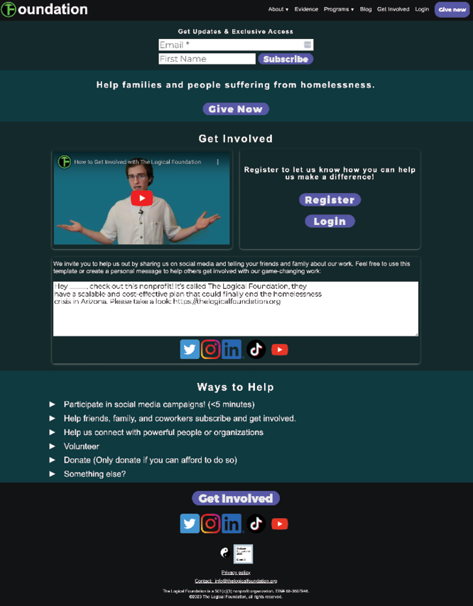
Type Hierarchy
There isn’t an H1 headline on this page, so if it comes up in a search engine the first thing it will display is the “sign up for our email” section.
Register vs Subscribe
Is the Subscribe function at the top the same as registering in the middle of the page? If they’re different, there should be an explanation of how and what users can expect from each.
Social Media icons
The message about sharing Logical Foundation with friends and family on social media combined with the proximity of social media icons suggests clicking on an icon it would like a “share this” function, but it’s just a link to the Logical Foundation social media accounts. Consider removing those icons or adding the “share this” functionality where appropriate.
Ways to help
This content isn’t very long, so it could be left opened and accessible without any additional effort for users. As it is, it looks like a bulleted list and has a high likelihood of not being interacted with.
Get involved button
This links to this page, looping users back to the top of the page. Even though this is a universal footer consider removing this link on this page.
Suggestions for the next iteration
A clickable prototype was built to show how these changes could be implemented.
Not all pages were recreated, and this only has placeholders for graphics, but is being used to illustrate the difference between the two experiences.
While not tested extensively with users, this restructured version well recieved internally by the board and team members who saw it, so the site redesign process was kicked off.